Project Runway: Episode 8: Project Pop Up
This is getting harder and harder. I am literally writing this hours before the show comes on tonight so it's going to be short, sweet and to the point.
For this challenge, designers were split up into three groups of three and had to design a cohesive collection of three looks inspired by a Mary Kay make up palette. I think it was Mary Kay, but I honestly don't remember. Bad me, I know.
Anyway, the three color palettes were "New Nude," "Red Violet," and "Hues of Blue." Once split into teams, the designers found out they would show their collections in a store front at a Sally Beauty Supply pop up shop and passerby's would vote on which collection they thought was best. The votes counted as 20% of their judgement score.
This being another group challenge, I would have been really nervous. The "characters" left?... Let's just say I would get annoyed pretty easily by almost all of them.
Since this was a group challenge and I wasn't there to have any influence on the team, I chose to design into the collection based on the route the teams chose, even if I disagreed as a viewer.
TEAM RED VIOLET
Team Red Violet...
What can I say. They decided to do a full collection in ALL red. I would have completely disagreed with this decision. In my mind, I like to think that if I were apart of the team, I'd combat that decision right to the end and add my own contrast color.
Their inspiration was a rock theme, so I tried to stick with that. What they came up with for rock was a miss to me, but who am I?
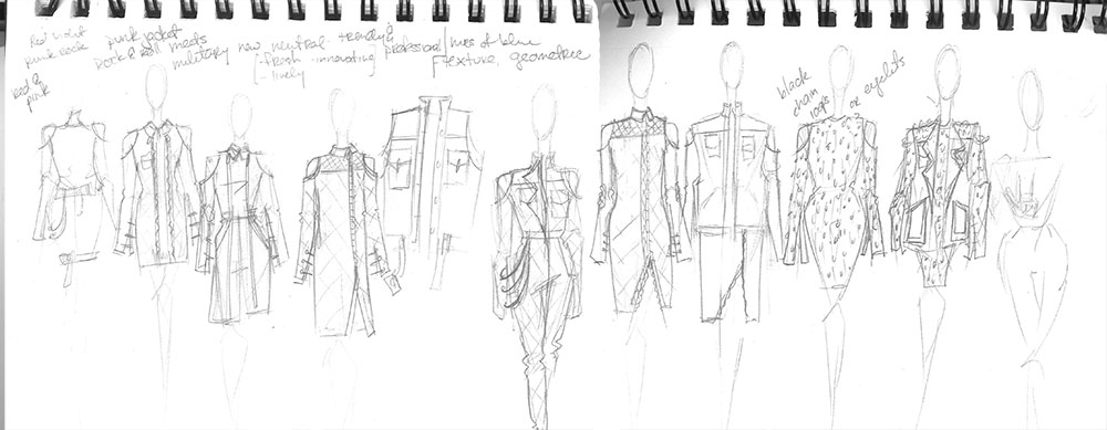
Conceptually, I wanted to focus on the stereotypical rock style. Distressed, DIY and a lot of edge and metal.
My final look turned out to be a red fit dress with peekaboo shoulders. The rock part comes in with the detail of various chain widths to be used as fringe. This could either look really good or really bad. In my head it looks good and is definitely different.
I wanted to add something to go on top of it but I probably wouldn't have had time with all of the work I would have to do on it and it would take away from the fun of the dress.
Judgement wise, I say with confidence that if it looked good, I would have been the top on my team. Dare I say that Kelly Osbourne, the guest judge, would have wanted it also? But it doesn't matter because the Red Violet team was the losing team.
TEAM HUES OF BLUE
Team member wise, I wanted to be on this team. The three were so chill and worked well together by understanding each others aesthetic and individually created three separate looks that complimented each other well. This was the hardest group for me to design into. Maybe that's a compliment to the designers or maybe it isn't.
The teams main color was blue but unlike Team Red Violet, Team Hues of Blue broke up their main color by adding a proportional amount of black and white. They too were inspired by rock but for a sophisticated lady; geometrics and shape played a roll also.
Creating the 4th look for this collection, I knew I didn't want to use their plaid. One more piece this fabric and it would have been overkill. I also noticed that the sleeve length on all three looks were 3/4 sleeve so I needed to change that up a bit.
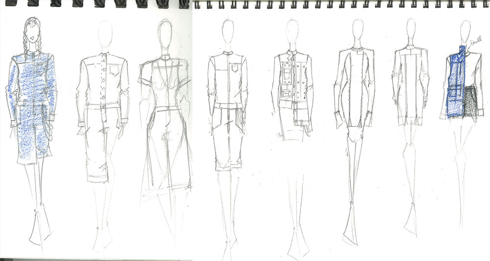
I had trouble choosing where to go in my overall silhouette while designing. Initially, I wanted some sort of button up which lead me to wanting a jumpsuit which lead me to design a vest. Keeping the black and white, I added a white long sleeve tee that uses Rick's frill trim at the neck and paired it with black natural waist shorts with a chain trim.
While I think my vest would have been appreciated, I don't think this look would have been much in comparison to the other three. You can't win them all, can you?
TEAM NEW NEUTRAL
On the day I watched this episode of Project Runway, this group created my least favorite collection. I liked the looks for the most part; the spin on the bomber jacket that Natalia did was dope but the overall collection left me wanting more. Everything needed to be turned up one more notch. It wasn't until I started designing into the group that I really appreciated it for what it was.
I felt the collection had a 1970's masculine vibe. I just kept picturing grandpa's basement den with the static TV and wood panel walls. Not my grandpa, but one like that. Everything looked easy and comfortable but elevated. The colors were tones of nude with a pop of burnt orange and denim blue. Adding the pop of color livened the group up a bit.
This was the last group that I designed into and my creative brain and hand were tired. Starting out, I had no real idea what to do because I found the collection so uninspiring but it eventually came together. When it was all said and done, figuring out the concept to this design turned out to be the easiest overall.
Conceptually, I knew I wanted to do a mini skirt. For my design, the skirt is various strips of wool in the teams color palette, sewn together to create an engineered textile print. Paired with a color blocked raglan tee and nude cape with peekaboo shoulders, I think my look would've been the best of the three.
This by far has been the hardest challenge to do. Not because of the type of challenge but because I am pooped. I had no idea that designing something every week could be so draining. And I'm not even sewing or rushed to make something, I'm only drawing and writing about it. I have another level of respect for the Project Runway participants.


